Overview
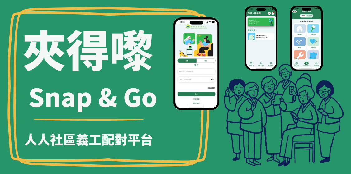
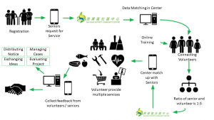
Snap & Go is a one-stop matching platform for seniors and volunteers. It is a collaborative project launched in June 2022 by the Jockey Club Design Institute for Social Innovation (J.C.DISI) at The Hong Kong Polytechnic University, the Hong Kong Council of Social Service, and the Sai Kung District Community Centre. The platform aims to match volunteers with rural elderlies based on their daily needs, creating an information-sharing and mutual support network for caregivers. This initiative helps elderlies receive more efficient and prompt daily assistance, raises awareness of the role of caregivers in society, and provides much-needed respite for overburdened caregivers.
Outcomes
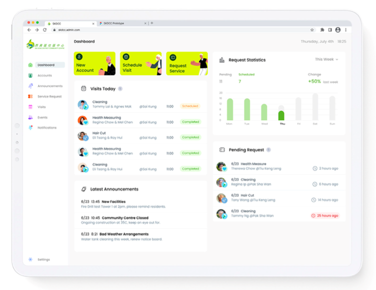
Snap & Go is expected to launch in the first quarter of 2025, and several community support organizations have already expressed interest in using the app in other regions. During internal testing, the app achieved the expected results. To cater to the diverse habits and needs of different stakeholders, the app features three distinct interface designs for elderlies, volunteers, and NGO workers. The elderlies can easily use the app to match with volunteers who can assist them with daily tasks such as home haircuts, shopping, and house cleaning. Volunteers benefit from a more structured and efficient communication platform that clearly records information and data for each task. NGO workers can use the app to send important event notifications and track the status of both elderlies and volunteers.
Process
Inspiration
The Sai Kung District Community Centre has long been responsible for community support work, but it has faced numerous challenges in providing assistance to seniors and organising volunteer activities. With over ten thousand elderlies living in 100 villages across the district, the low population density and distance from urban areas have limited the community services available to the elderly and caregivers. This isolation makes it difficult for elderlies to access volunteers and receive support, further increasing the burden on caregivers. Additionally, when organizing past activities, the center struggled with communication issues and inefficiencies in managing large numbers of volunteers due to the limitations of communication apps.
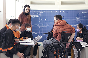
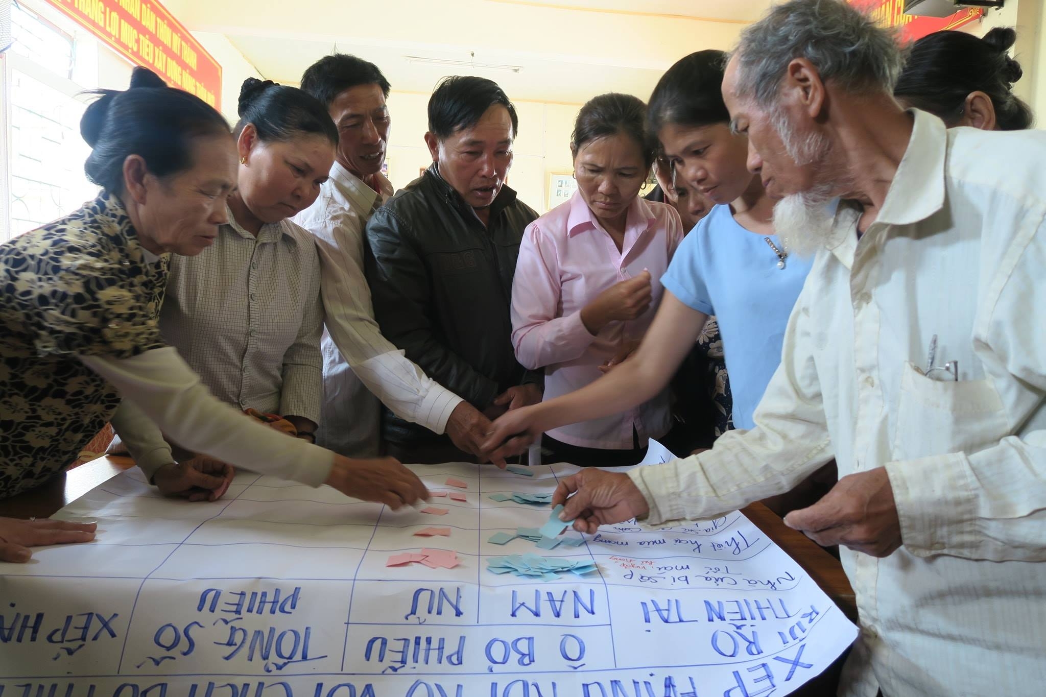
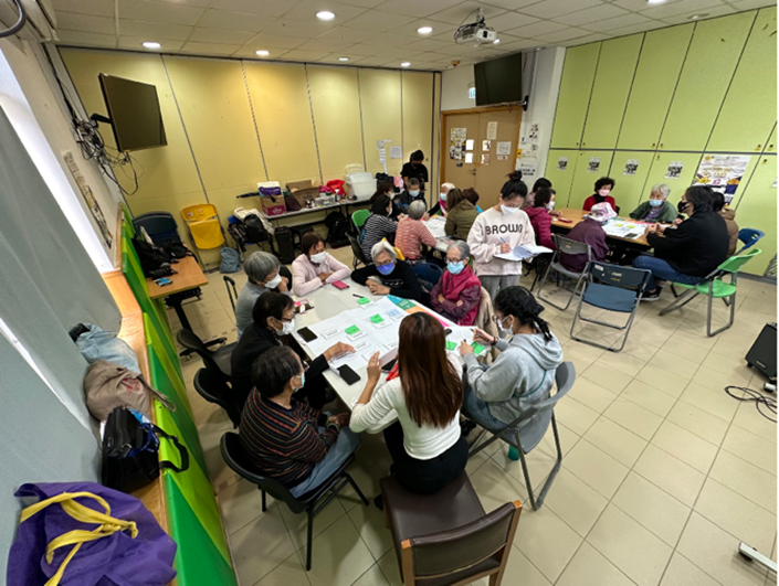
With these fundamental problems in mind, J.C.DISI held multiple workshops to gather input from stakeholders, including seniors, caregivers, and volunteers. This feedback was incorporated into the design of Snap & Go, to create a one-stop app that understands the needs of seniors and caregivers, efficiently notifies relevant volunteers, tracks services provided, and facilitates follow-up when necessary.
Ideation
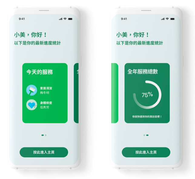
During the conceptualization process, while the overall direction of the app remained unchanged, more effort was put into the interface design to meet the needs of the three main user groups: elderlies, volunteers, and NGO staff. One of the primary users of Snap & Go is elderlies living in rural Sai Kung, whose ability to understand visual elements and operate apps differs from typical users. Apps designed for younger users often feature multiple colors, varying button placements, and diverse functionalities. Younger people, having grown up using digital tools, find such apps easier to navigate. However, seniors may misinterpret icons, such as mistaking a “photo” icon for a house. Moreover, if button placements change across different pages, seniors may struggle to adapt. They prefer consistent button placement, regardless of the content displayed on the page, which better aligns with their usage habits.
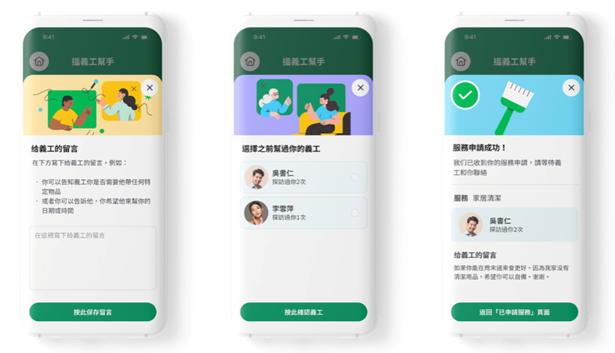
The project began during the pandemic, and after collecting elderlies’ feedbacks on digital literacy, the team found that many of them were familiar with certain mobile apps, including WhatsApp and LeaveHomeSafe (Chinese: 安心出行). As a result, the team decided to incorporate green elements from these apps into the design of Snap & Go. They also fixed the button positions across all pages, simplified the functionalities as much as possible, and added text explanations beneath icons to help elderlies understand and use the services more easily.
Implementation
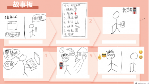
After the project team gathered user requirements for the app, they worked with a software development company to create a prototype that simulated the entire app usage process. This allowed seniors and volunteers to test the app. Throughout this process, the project team communicated with various stakeholders, not only to summarize suggested improvements but also to clearly define the needs, which would significantly influence the app’s functional design.
In the prototype, one service involved volunteers visiting elderlies’ homes to prepare soup. However, after testing, users found that this service offered limited benefits, so it was changed to a grocery shopping service. Another example is the volunteer interface. Originally, when an elderly requested help, their home address was displayed directly, raising privacy concerns. In the revised version, volunteers are shown the senior’s general area when a request is made, with the specific address only provided through a phone call after the volunteer accepts the task.
